IFRC's Ecological Connectivity & Community Resilience (ECCR)
Brand Identity
Brand Identity / 1:1 Consultation / Collateral Design
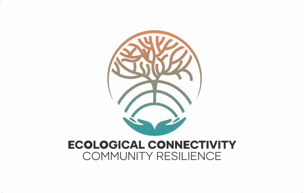
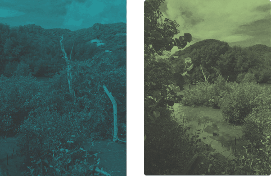
The Ecological Connectivity & Community Resilience (ECCR) project, led by the International Federation of Red Cross and Red Crescent Societies (IFRC), called for a visual language that could embody the interdependence of human and natural systems across the Caribbean and Latin America. SOLA Creative Studio developed a brand identity that mirrors this interconnectedness.
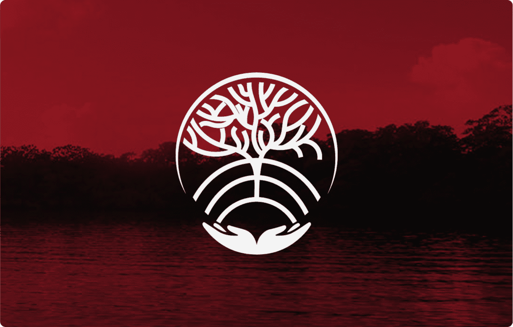
At its heart, the ECCR emblem unites coral reefs and mangrove roots. The coral forms the upper half of the symbol, representing the vibrancy and biodiversity of marine ecosystems, while the mangrove roots below evoke stability, protection, and regeneration. Together, they form an abstract network of connection — one that also recalls the rhythm of digital signals, symbolizing the flow of information and community resilience.
The logo’s minimalist form and balanced geometry were designed for adaptability across digital and print applications. Its aesthetic merges environmental symbolism with a contemporary sense of precision and clarity. Each line and curve carries meaning: coral for diversity, mangroves for strength, and the fluid link between them for collective care.
The visual system extends through a thoughtful colour palette that blends deep oceanic blues with coral and olive tones, inspired by marine life and coastal ecosystems. Together, these hues convey trust, vitality, and ecological harmony.
The resulting identity is both grounded and dynamic, offering a visual framework that honors the resilience of nature and the communities who protect it.