Sharpa Notes carries the vision of Sharda Patasar, a phenomenal sitarist whose initiative opens pathways for young people to encounter music as a space for imagination, discipline, and joy.
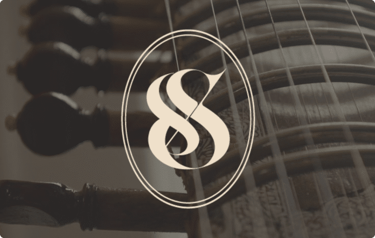
The brand identity is built around a mark where two mirrored “S” forms flow into one another—an upright and inverted gesture cut through by a sitar string. The lower curve echoes the body of the sitar itself, while the enclosing oval brings balance and continuity. This interplay of form suggests movement, duality, and flow—qualities central to both music and the brand’s presence.
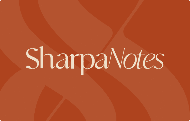
Typography is shaped by an elegant serif with high contrast strokes, giving the wordmark its classical clarity while remaining approachable. The palette is drawn from an earthy Indo-Caribbean landscape—tones of clay, spice, and warmth that hold the richness of rasa: sensuality, feeling, and the layered resonance of sound. Sharpa Notes emerges as more than an identity; it is a visual echo of Sharda’s artistry, where memory and culture converge into a mark alive with presence, balance, and emotional depth.