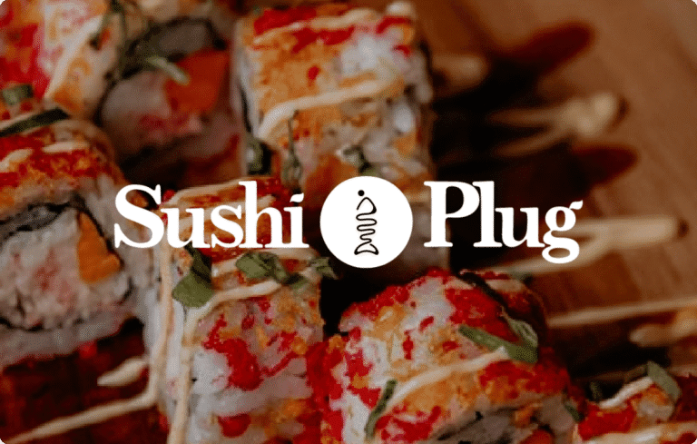
Sushi Plug reimagines sushi for a Trinbagonian audience—an experience often seen as unfamiliar or intimidating, reshaped here with a sense of ease, joy, and adventure. The identity captures this balance of tradition and play: the logomark forms a half-man, half-fish figure, its upper curve bending forward in a seated posture reminiscent of the traditional way sushi has been enjoyed in Japan.
The wordmark leans on a beautiful serif font, its letterforms suggesting something organic, echoing the brand’s focus on local, fresh ingredients, while the sans serif introduces a contemporary edge that keeps the identity approachable. The palette is anchored in Penn Blue and Tomato, a deep oceanic blue set against the vibrancy of salmon, with accents of Saffron and Shamrock Green adding freshness, optimism, and warmth.
Together, these choices reflect the brand’s spirit of discovery, inviting people to taste sushi not as something distant, but as something joyful, shared, and close to home.